Colour
The complete spectrum: crystal white to onyx black
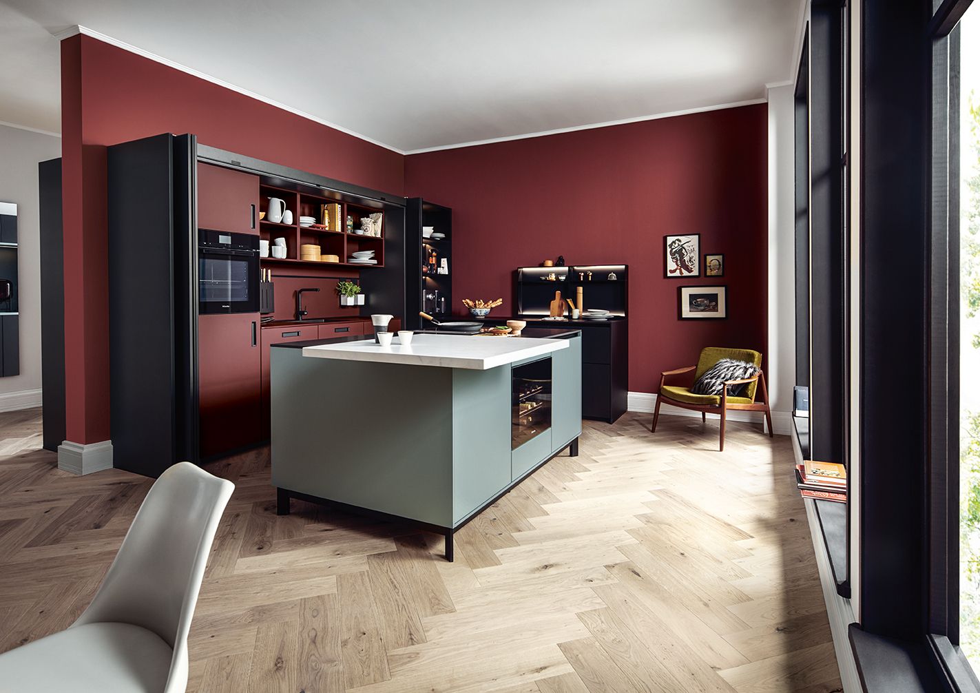
Vibrant ruby red meets reduced agate grey: rich colours are set off to best effect when alternated with natural tones. This helps to put individual areas in the spotlight or to set them consciously in the background.


The use of colour or the deliberate avoidance of it shows the special aesthetics of the Bauhaus concept – as well as its adaptability, openness and freedom. Who would have thought that even colourful painters such as Wassily Kandinsky or his Colleague Paul Klee helped to characterize the Bauhaus movement? The next125 kitchen fronts combine shades such as crystal white and agate grey with colourful accents: stronger tones such as saffron, curry and cognac, or darker nuances such as anthracite, jaguar green or ruby red.


Colours are set off to best effect in particular when they are to be seen in alternation with natural tones. The Bauhaus principle of reduction can therefore also live on in next125 kitchens in the combination of colours or non-colour. The result: simple elegance paired with vibrant accents.
The variety of the materials used and the finishes available ensures a broad spectrum of possibilities: whether matt or high gloss, the purest white or natural tones, discreet grey or ruby red. Whether through-dyed laminate, elegant lacquer or high-quality wood types. Whether satinated or smooth finished – next125 enables the consciously planned designer kitchen. Glass fronts add an additional effect thanks to their intrinsic colour facets and bring metallic tones such as bronze and platinum into play. Ceramic fronts in concrete grey or graphite are available.

The next125 palette is large, and invites you to express, and not just with its personal favourites. The mood of the room and effect can be influenced with its help and the appropriate highlights. In this way, the colours help to brighten up your own kitchen or set it reduced into the background.
All rights reserved.