Colour psychology
Colour psychology in the kitchen – More than just red or green
In terms of colour psychology, colours evoke different emotions and moods. These insights also find their way into the kitchen – next125 shows you how the deliberate use of front colours creates unique kitchens based on the occupants’ preferences and personalities.
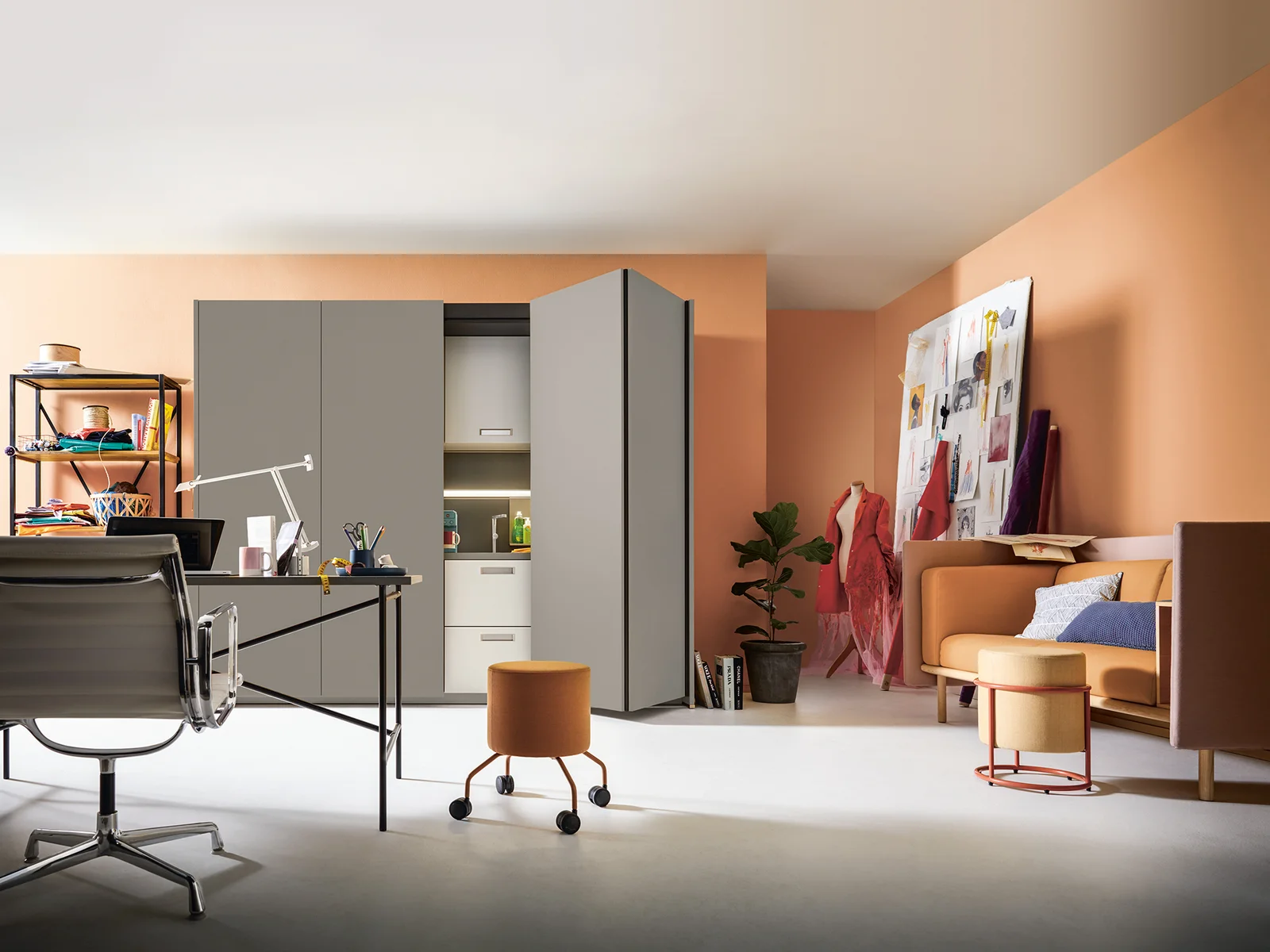
The kitchen is the hub of the home – it’s where we meet, have breakfast together and cook with friends. In its role, the kitchen must be functional and also meet aesthetic and individual design-specific requirements. Alongside materials, kitchen layout and choice of appliances, the selection of colour also greatly influences whether or not the kitchen becomes the desired oasis of well-being.
Not only in open kitchen designs, which should blend in perfectly with the living or dining room in line with a holistic design concept, but in closed kitchens too, the right colour is especially to be taken into consideration. The magic words here are colour psychology.
Effect of the colours
Relaxing, appetite-arousing or energising: colours affect people
Colour psychology looks into the effect of different colours on human feelings, moods and behaviour. It has been able to demonstrate that different colours have different effects on human emotions. Applied to many areas, it is used to design user interfaces that are as visually appealing as possible or to raise awareness through the targeted use of certain colours or colour samples.
When planning your own kitchen, the deliberate choice of colours enables the room to be perfectly tailored to the members of the household and creates an atmosphere of well-being. Whether you want to convey love or a proximity to nature, the right colour, be it light green, bright red or elegant black, enables you to create an atmosphere that perfectly matches your design style and disposition.
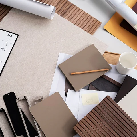
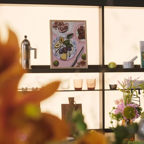
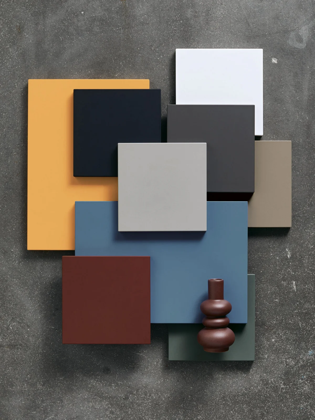
A touch of colour
next125 fascinates the senses
With its unique, extensive colour concept, next125 has created an outstanding selection of front colours to meet all needs. Selected shades from the next125 portfolio illustrate this through a range of combination options in the kitchen in line with colour psychology.
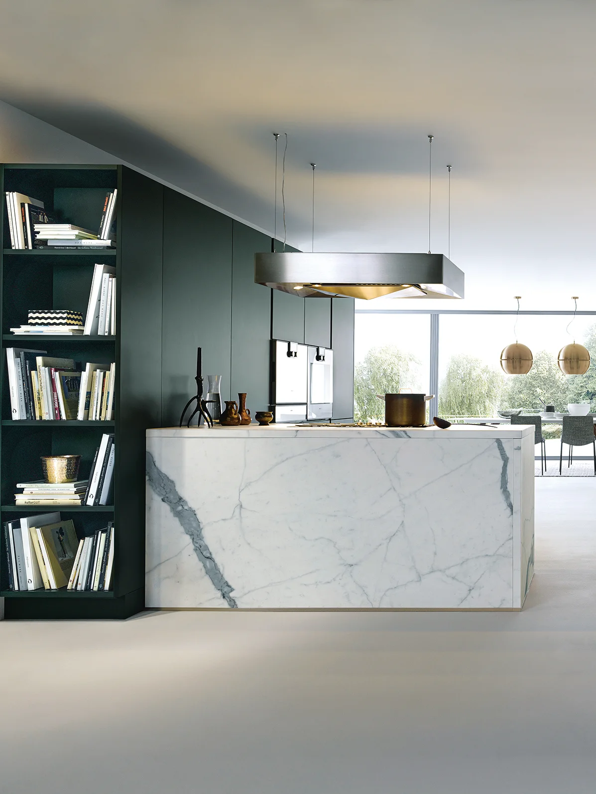
The colour green in the kitchen
In colour psychology, the colour green is linked to relaxation, familiarity and nature. Combined with wood, which subtly embraces the natural aspect, or other natural products, a fresh and airy oasis is created. After a busy day at work, you can relax here as you cook your evening meal – thanks to the link with nature and a choice of colours that convey homeliness and comfort.
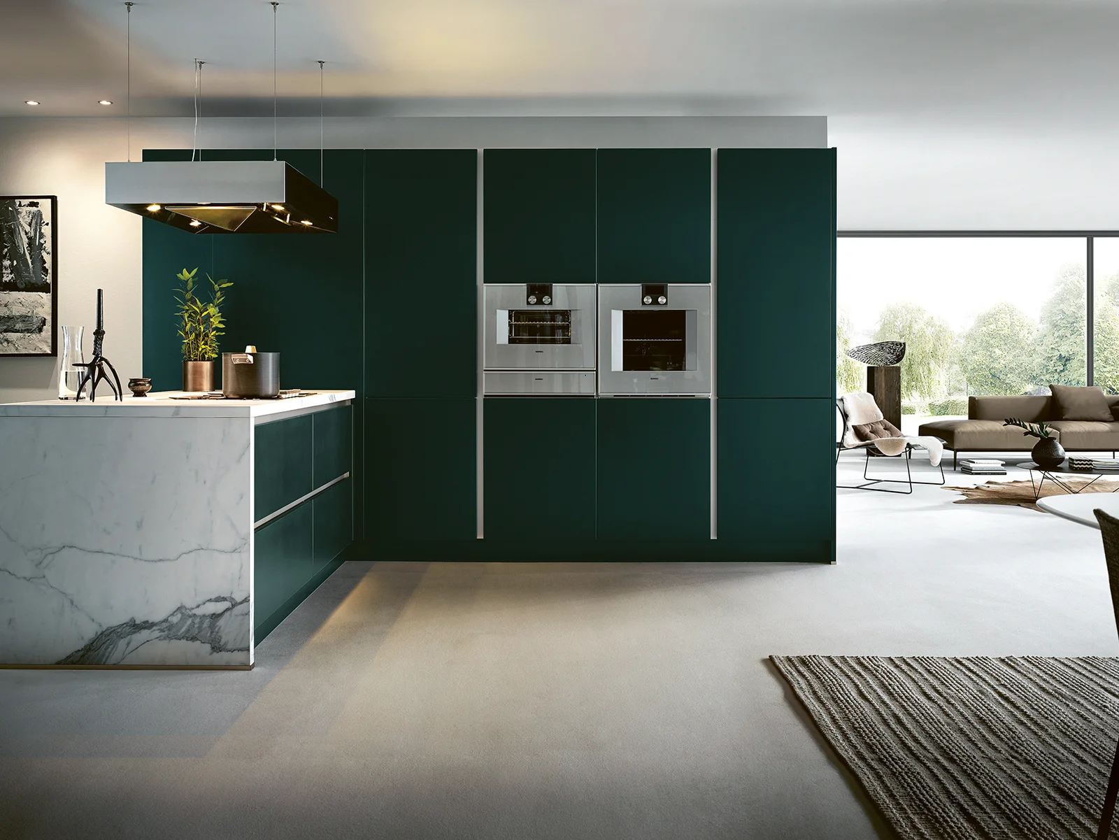
Jaguar green fronts go perfectly with wooden elements made of old oak and a marble-look ceramic worktop – the pure elegance of nature. At the same time, the vitality of the wood and velvet matt lacquer fronts impresses by perfectly amplifying the inherent homeliness of the colour combination.
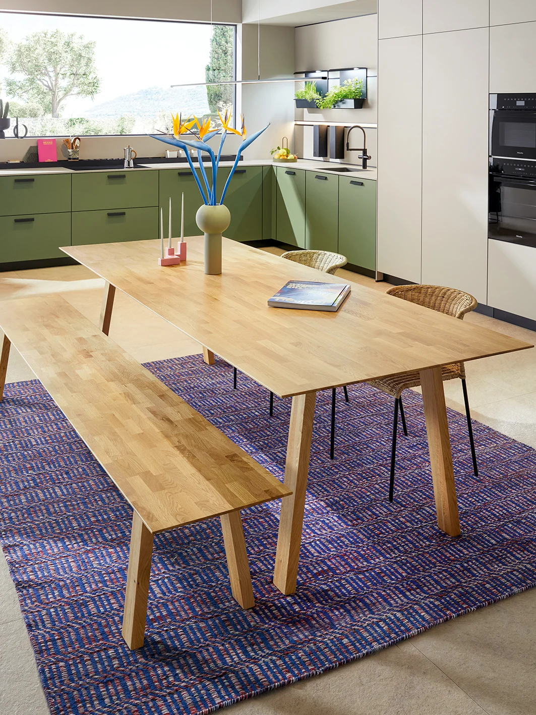
Also combined with wooden elements in the form of the next125 table and bench, this kitchen once more demonstrates the lightness of the green fronts. The next125 cube recess system with plant pots for homegrown herbs adds a unique Mediterranean touch, which is perfectly embraced by the pleasant olive green colour of the fronts. Holidaying at home – where well-being is a must.
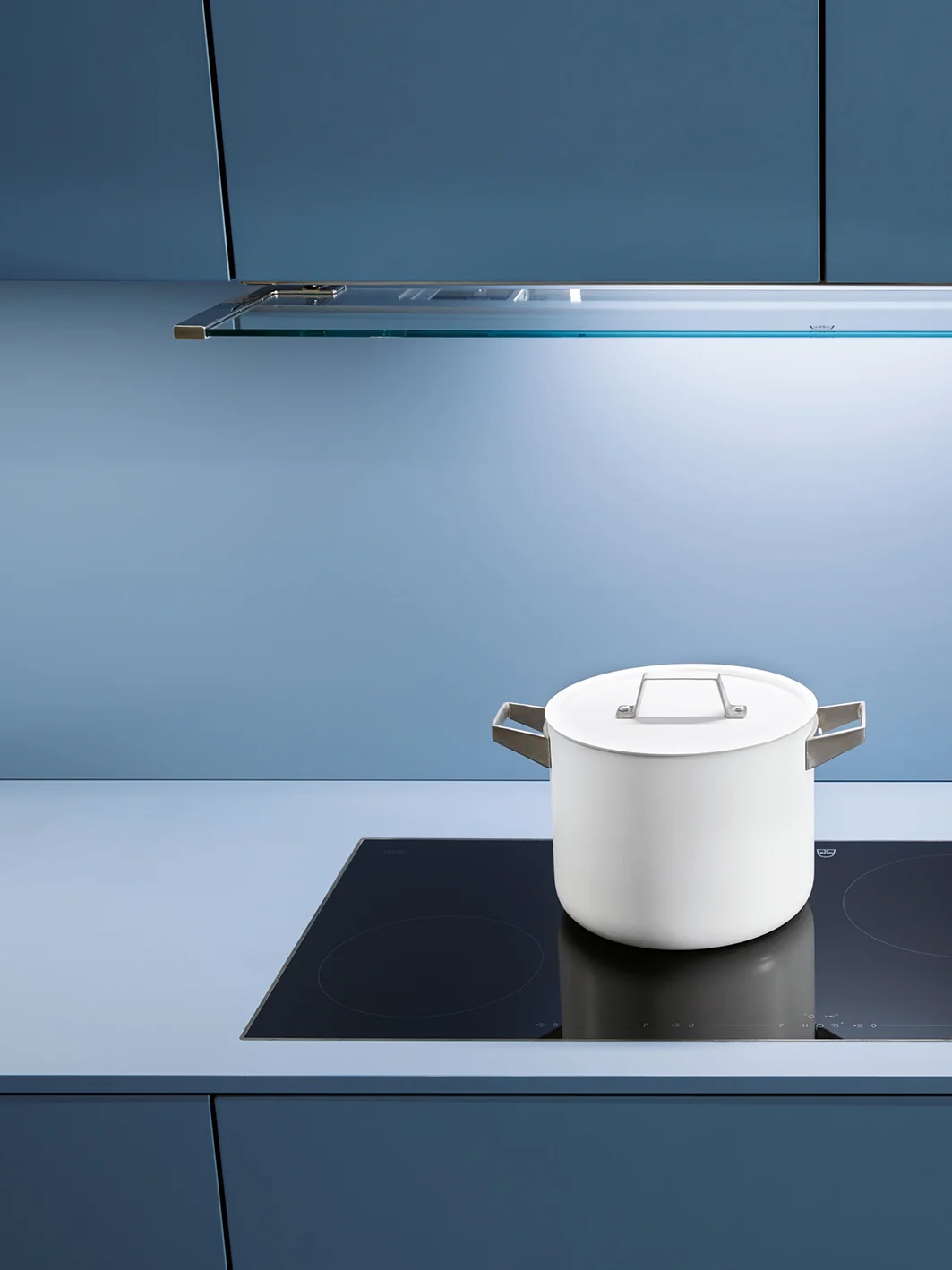
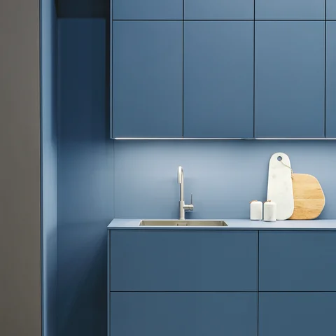
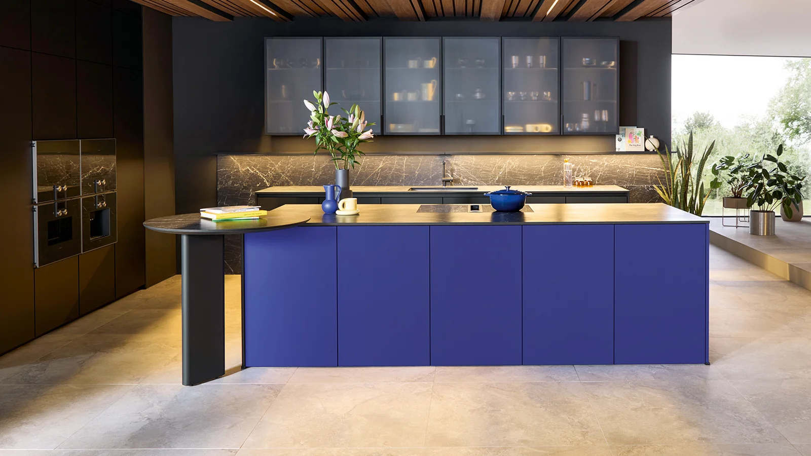
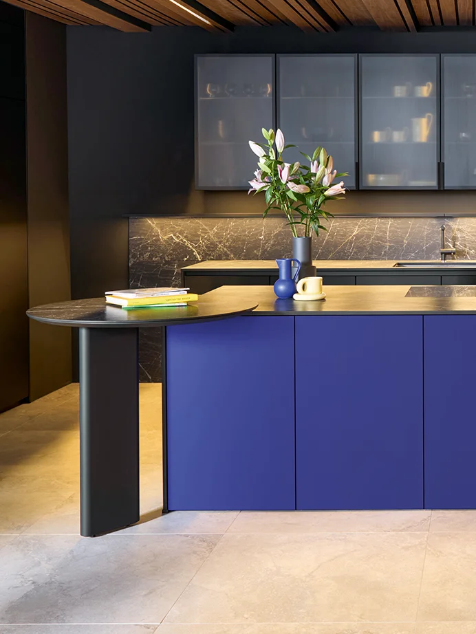
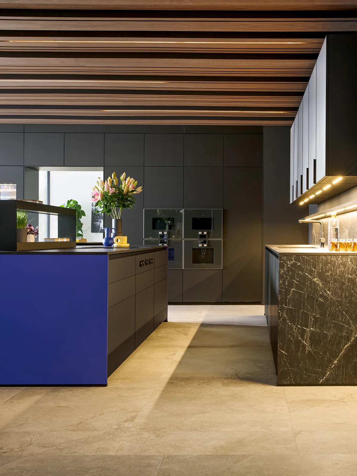
The colour blue in the kitchen
Elegance, balance, calm – associations that are instinctively linked with the colour blue. The infinite vastness of the sea is also reflected in the matt velvet azure blue of this kitchen – the perfect place to do some soul-searching while preparing and cooking meals, and to serenely look forward to the next day. What’s more, light blue tones make rooms look bigger, and when combined with grey walls, they create a modern, perfectly balanced look.
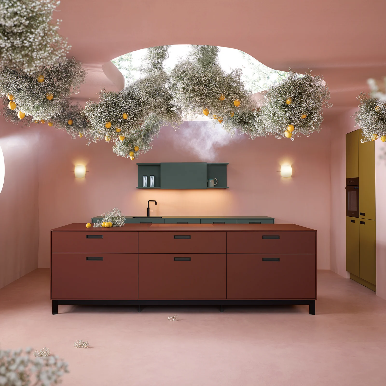
The colour red in the kitchen
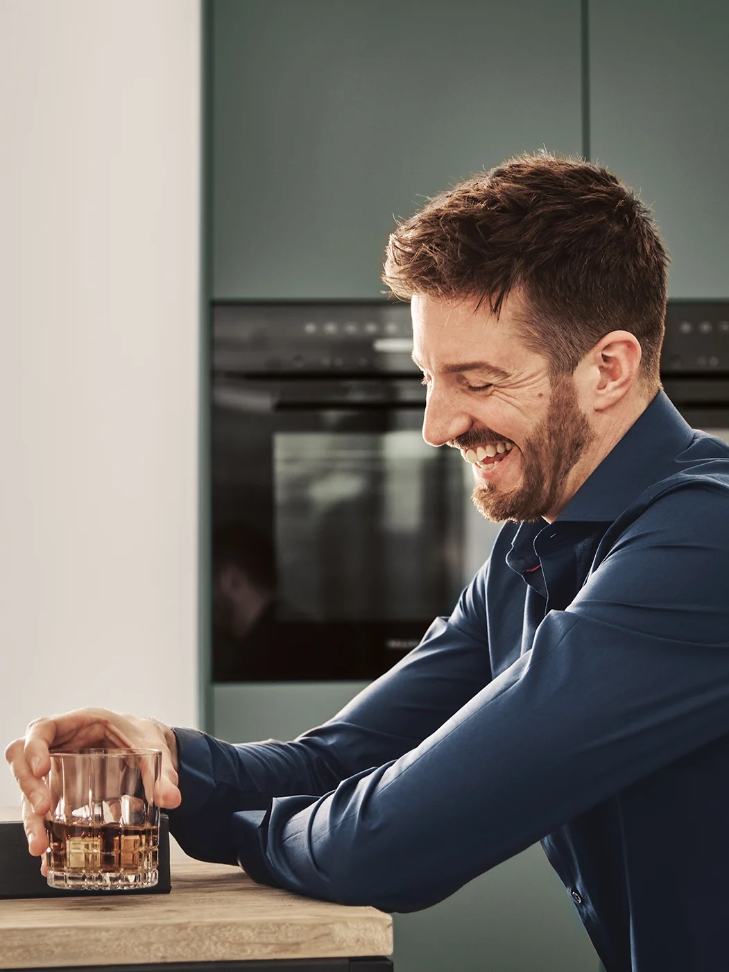
The warning signal effect of the colour red is widely known, but in the kitchen it adds warmth and energy. It also stimulates appetites, so it is predestined for use on kitchen fronts or walls.
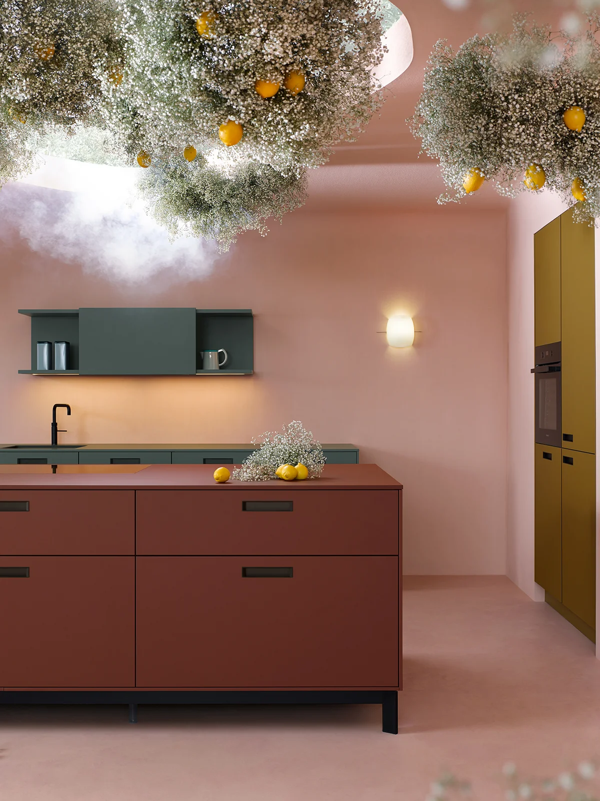
Campaign "Flower Art"
The kitchen as a work of art
For the first motif, “Flower Art”, we asked photo artist Claus Friedrich Rudolph and botanical set designer Valentina Teinitzer to combine flower art with the kitchen. The result is an exciting contrast between precision and technology on the one hand and vitality and opulence on the other.
Find yourself with the right combination of colour
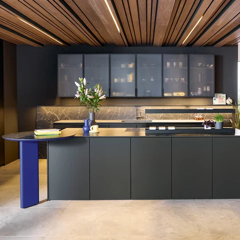
Not just red, blue and green but other colours are also associated with certain moods. For instance, yellow kitchen fronts convey a feeling of warmth and happiness and are best suited to optimists, while classic white or modern grey fronts come across as neutral, timeless and pure. Whatever colour or colours you decide on in the end, colour psychology can be a source of inspiration that guides you to make the right choice – for a kitchen that matches your style and personality.